I spend a lot of money on “micro transactions” every month. iTunes, Amazon, Playstation, etc. Each one is usually less than $20 a piece, so it never seems like I’m spending much money, but collectively it adds up quickly as you might expect if you’ve ever done math.
I was challenged by my lovely wife, Emily, to curb that trend of micro spending, and try to spend less than $1000 over the next 3 months left in the year. “Easy!” I thought, “I’ll just whip up a Google Spreadsheet and track my spending!” A few problems quickly arose:
- It’s ugly
- It’s possible to track on the go via their mobile app, but it’s clumsy
- I’m an engineer, why not reinvent the wheel?
It was that last point that really stuck with me. I am an engineer! Why not just build something?! As I sat down, and fired up Xcode I asked myself, “Shouldn’t you at least look to see if there is an app that already does what you need? Also, you don’t know how to use Xcode.” I was right again.
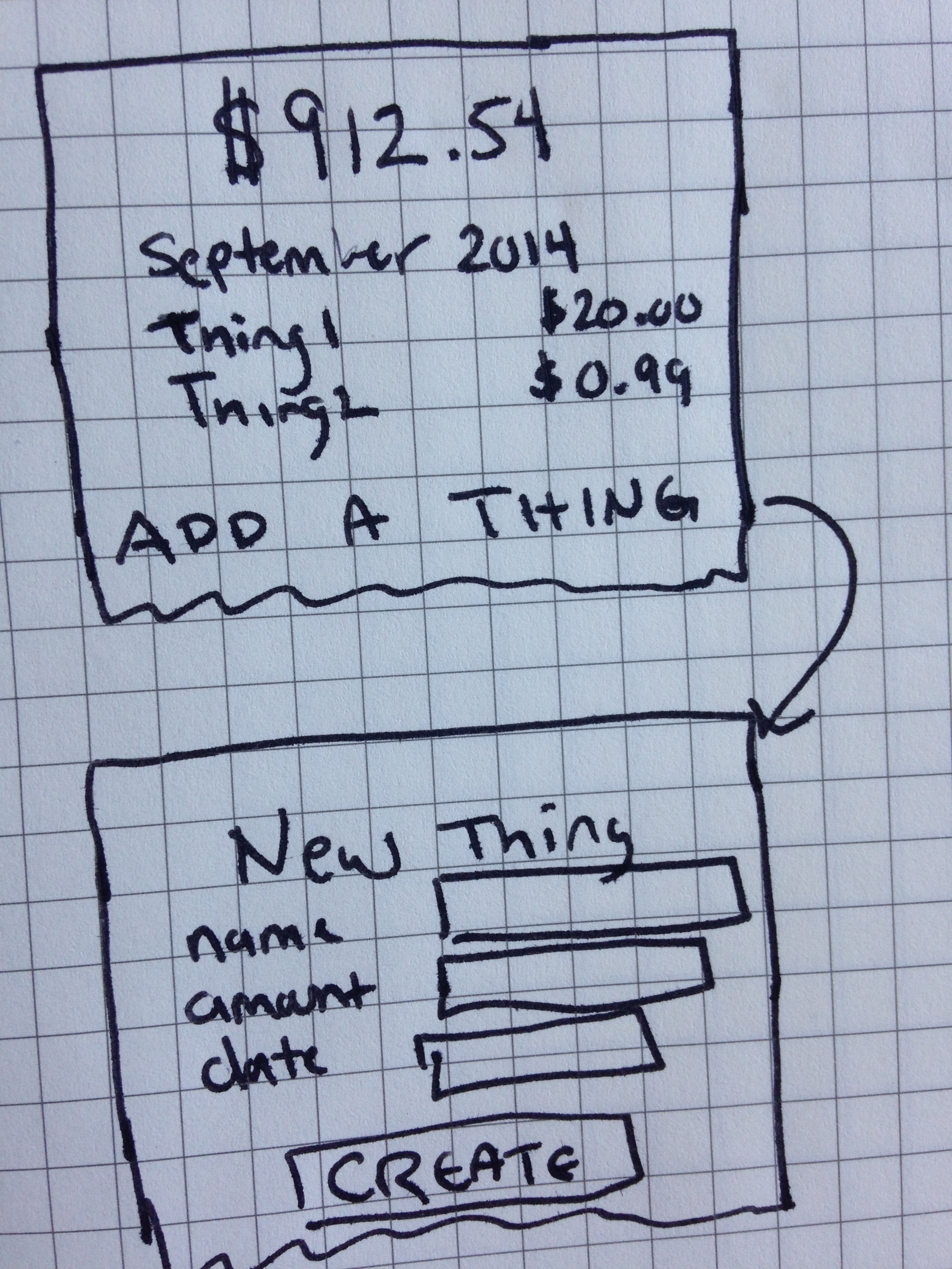
I opened up the App Store and went looking. I downloaded five apps or so, and tried them all out over the next few hours, but none of them were simple. None of them did one thing well. So I went and grabbed a piece of paper, and drew this:

It was simple:
- current balance at the top
- grouped list of all purchases
- a way to create new purchases
I fired up Xcode again, and was quickly reminded that I still don’t know what I’m doing there, and I wanted to get my idea coded fast, so I went with what I know. Even though it was a lot of overhead, I created a new Rails 4 app and figured I could iterate over it as I went on. Rails is a great fast-prototyping tool with all of it’s magic and conventions.
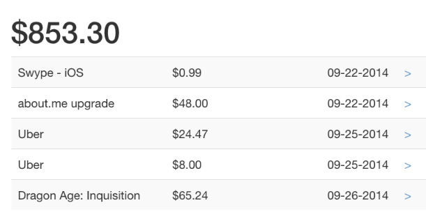
Within an hour I had this:

It had all the pieces I needed for a v1.0. So I shipped it off to Heroku.
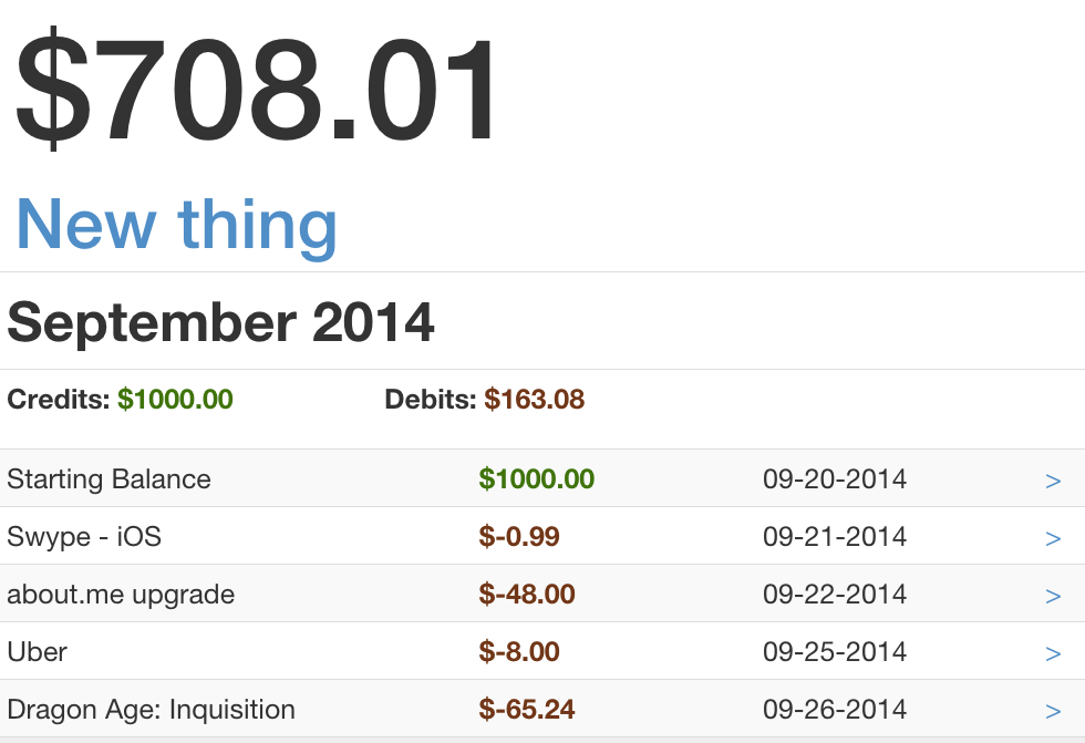
Since then I’ve spent more time on it and have added more features and refinements:
- Twitter Bootstrap (responsive design, what?)
- Facebook Auth (via devise/omniauth)
- jQuery Datepicker
- Colorized debits/credits (with monthly grouping)

All in all I’m pretty happy with where I’ve gotten in the amount of time I’d put into it. There are more refinements that I have planned: Backbone or Angular front-end, in-line editing/creating, tagging purchases, but they can wait now that the app actually works well, and I can use it at a desktop or on my phone.
